Wordcandy chats with the Sourcebooks graphic designer!
Mar 26
2009
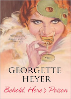
As longtime readers of the site know, we care (maybe more than we should) about cover art. It's all very well to say you shouldn't judge a book by its cover... but, hello, there are a lot of books out there, and how else are you supposed to judge 'em, at least initially? So we were very excited to have a chance to interview Dawn Pope, the Sourcebooks graphic designer responsible for their lovely new Georgette Heyer covers!
Can you tell us a little about your work process—do you start with a pencil and paper, or do you go straight to the mouse?
As far as my process, I am a straight to mouse kind of gal. I get a lot of my inspiration from image research. I start with an idea, usually based on the premise of the novel, the characters a scene, what the time period is. If a manuscript is available, I will try and read a chapter or two if there is time. But it is the image research for me that inspires where I want my design to go.
What is a typical time frame to get a cover from assignment to final approval?
Our typical time frame for cover design is generally about 3 months. This seems like a lot of time, but when you are working on a list of over 140 titles, this is a bit daunting. I usually design about 30 covers off of our seasonal list.
How often do you bring (or the editor brings) an author into the process?
Most all of our authors are involved in the cover design at some level. Some more than others, it really depends on their contract. Our authors always have approval over the final cover. I really like to involve the authors, and meet their expectations, because after all this is their work, their reputation, their career. It is my job to do the best I can, design the best I can to make their hard work fly off the shelves.
How do you arrive at a balance between producing covers that meet the needs of the editors, marketing, store buyers and consumers, while maintaining a creativity level that’s personally gratifying?
Oh, the delicate balance… this is a tough balance. There are so many elements that not only go on our covers, but that affect the cover design. To achieve the perfect balance, it really comes down to knowing the category, what works what doesn’t. The only way to really do this is to spend a lot of time in the bookstores and online to see what is working in the market place, what works on shelf. Things you wouldn’t even think to consider like, the lighting in the store, the type of shelves your leading retailers have. For example, are their ledges on the shelves, will the authors name or title be blocked if placed too low on the cover. Lighting is important because you don’t want your cover to be too dark and not legible.
We work very closely with our editors, marketing, sales and publicity departments to make sure that the look, the language and design of the cover work for that category. Our publisher, Dominique Raccah, also has final say in the approval of the covers and she has a very wide breadth of knowledge in all aspects of this book; she knows what is going to work and what won’t.
Once you understand the market place and the audience you are designing for, it allows you to design to a self gratifying level, while having a successfully functional cover and a successful book.
If you were to talk to a classroom of aspiring designers, how would you describe to them what book design is? How is it different from other forms of graphic design (say, CD packaging)?
This is one of my favorite things, I actually do go back to my high school twice a year to participate in portfolio reviews and talk to the design classes there. Book design is a very complex process, there is so much that goes into consideration when designing book covers. Like the biggest issue is that a cover is never done, it is never perfect. You may go out with one cover, then the book doesn’t work well on shelf, if that book comes back up for reprint, then sometimes we redesign the cover to make it function better. A book cover is a marketing piece and you have 30 seconds to sell the reader. It is funny that they say you can’t judge a book by it’s cover, because that is exactly what you do… it is that cover that gets you to pick up the book and read on. If you don’t convey the information in an eye catching easy to read way, you just lost a sale. I would say the biggest thing with book design is that it is always around. I got my start in magazine design for a non-profit agency, that was one month and the work was done and gone. With a book, a good book, it is around for a long time. Same way when you look at web design, it is an always changing platform. I have to say, that is why I love book design, I like my designs to be tangible, and something you can have around always.
What influences have contributed to your design style?
I don’t know if there are specific influences to mention, but I like very clean design. I like white space, and I am a typography nut... I love type and fonts. I love to see how you can arrange a title. I put a lot of emphasis on my type and my font choice. I had never considered myself an artistic person until I started taking a production graphics class in high school, I discovered a love for design and creating printed pieces that took me into college where I had to learn all about art, how to draw, how to sculpt, and how to design.
I took a book design class and it was setting mass amounts of type, for the internals of the page that fascinated me. It has been a learning experience every step of the way, and I just keep learning.
Who are the book designers you look up to?
I would say Chip Kidd tops the list... he is the definition of a book designer. Other than that, I admire all designs, some of the most classic designs I look up to come out of Chronicle, Penguin and Random House. They have amazing designs, and I can only hope to compete on their level with every one of my designs.
How many of the books you design covers for do you read?
Unfortunately, I don’t get to read a lot of the books before I design the covers. Our editors provide us with cover information, the character descriptions, setting, time period and mood. A lot of times when we are designing covers, the manuscript isn’t ready yet. I do like to go back and I try to read every book, which is why currently I am reading three books... gets a bit crazy.
Is there any book for which you have a burning desire to rework the cover?
Oh geeze, any book from my first year in book design. I am still generally okay with my covers, there are a few that when I look at them, I think, “Oh, I could have done so much better...” but that is the beast that is book design. Like I said before, they are around for always, I see them over and over again, but when I compare them to what I do now, I see how far I have come. All I can think is that with each title and each cover it is a new challenge and a learning experience, and I can only get better.
Thanks so much for taking the time to talk to us, Dawn!
Posted by: Julianka
No new comments are allowed on this post.
Comments
No comments yet. Be the first!