Ugly Cover Art: Part 872
Aug 1
2006
 I'm currently halfway through Jonathan Stroud's Bartimaeus Trilogy, and I'm really enjoying it. The books are total Wordcandy, and Stroud is a talented writer with a gift for making up some truly unpleasant personalities.
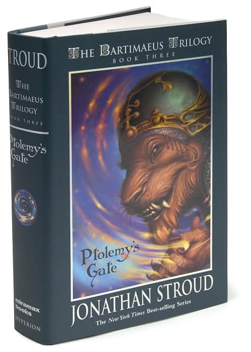
However, there's a reason that I'm only reading these books now, rather than when the first one came out in 2003: the covers are wicked ugly, so I waited until I found copies on sale. Not just a little ugly--we're talking hardcore hideous. The samples on the left don't do them justice. On top of the basic artwork (which wasn't much fun to look at to begin with) they're opalescent.
 Now, my son thinks these books look awesome. (In his defense, he's seven.) I don't think Stroud is aiming at the elementary crowd with these novels, however. The main male character is about as far from Harry Potter as you can get, the bad guys are almost Dickensian, and the main female character is essentially a terrorist.
Look, this series is a prime example of why we keep harping on cover art. I'm sure Mr. Stroud's sales are respectable, but if the books were even slightly more attractive, I think they'd attract a much bigger audience. People like me would be buying them in hardback, even though they cost the earth. But it would be worth it, just to avoid looking at that glimmering minotaur dude whenever I picked up my book.
Posted by: Julianka
No new comments are allowed on this post.
Comments
Anonymous
Perhaps alternate covers, for children and adults?