Gross, gross, gross
Sep 3
2014
Margaret Talbot over at The New Yorker recently posted an article that perfectly sums up my feelings about the deeply creepifying new cover art for Roald Dahl's Charlie and the Chocolate Factory:
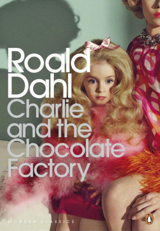
"You can imagine what the designers were getting at. Dahl is darker and edgier than most beloved children’s authors. In “Charlie and the Chocolate Factory,” the obnoxious children suffer ignominious comeuppances—one falls into a filthy garbage chute; another blows up like a giant blueberry—and these are observed with sadistic glee by Willy Wonka and the author alike. The trouble is that the designers went for the wrong sort of darkness. One thing that Dahl’s books for children are not is sexually perverse, or indeed sexual at all... [And] if the Stepford daughter on the cover is meant to remind us of Veruca Salt or Violet Beauregarde, she doesn’t: those badly behaved squirts are bubbling over with rude life."YES. And I'm amazed, because this seems like the kind of image you'd think publishers would be extra-cautious about featuring—Talbot's article, like many others, specifically mentions JonBenét Ramsey. Who wants to evoke that kind of association with their reprint of a childhood classic? Are there enough really people out there wishing for an "edgy" version of Charlie and the Chocolate Factory to offset all the potential buyers who will find this image totally off-putting...?
Posted by: Julianka
No new comments are allowed on this post.
Comments
No comments yet. Be the first!